ShopDreamUp AI ArtDreamUp
Deviation Actions


Description
view 100%
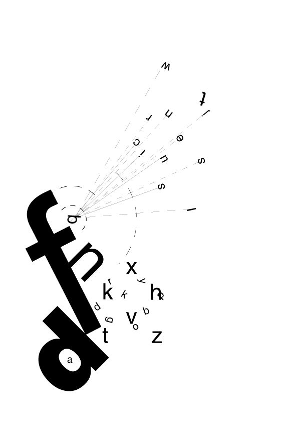
An attempt of creating the feeling of a word using letters in various formations
Each part of this image is created to give the feeling of 'frustration'
f - As it has a larger stroke it shows that it is proud to be what it is and where it is. Looks like its at 45 degrees - just off.. not such a big man now
croud 1 (top right) - looking at the 'perfect Q', thinking its the best place to look. The 'q' is off and turning its back to the main croud. 't' doesn't care as much about the q but is still frustrated that hes being rejected either way
n - on a perfect 45 degree angle but with its neighbour 'f' its look it spoilt
d - as with 'n' this letter is perfect but spoilt by f's angle
Overlapping - letters to the right are perfectly vertically/horazontally aligned but because the space around the letters isn't white the text around the letters make the perfect letters unbalanced
a - this is the only part of the image that is perfect - whole number for text size etc. and position. But because its it the most frustratingly designed image its completely out
layout - the piece is also asymmetric making the weight of the text attract the viewer in an unconventional way
Hope you enjoy this different piece of design
Comments and Critique welcome as usual
- Deviantart has no Typogrpahy section so I put it here.
Image size
595x842px 49.64 KB
© 2005 - 2024 techitch34
Comments2
Join the community to add your comment. Already a deviant? Log In